A month ago, my first Skillshare class Reign Repeats: Create Perfect Repeat Patterns in Illustrator started. As part of the first three weeks of the class, I promised the students to showcase my favourite 15 designs and run a contest to choose the top 3 that will win fab prizes donated by the amazing Spoonflower.
Choosing the 15 below wasn't easy because all of the projects I've seen so far are great. I'm really proud of all of my students for the beautiful work they've created and the dedication they've shown in the class. However, a decision had to be made and I'm really sorry I couldn't just choose you all. I chose the following designs based mainly on three criteria: repeat layout, colour use and originality of their concept.
Stephanie is an Illustrator newbie so I was really impressed by her final design. Her motifs are beautiful and the picnic theme is clearly portrayed in an original way.
 |
| A- every birdy loves a picnic by Stephanie Sims |
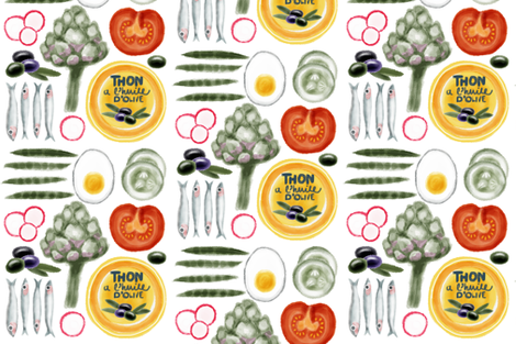
Kate's amazing illustrator skills captivated me since the beginning. I'm just in love with her water-colour drawings and that egg!!! Her illustrations make me want to eat all of those ingredients and her colour palette really speaks Mediterranean :)
| B- salad niçoise by Kate England |
Sofias's design is whimsical and cute. I love the way she created a doodled ant trail creating an interesting texture in her design.
 |
| C- picnic ants by Sofia Figueiredo |
Elise's design seems simple, but it really isn't. The way she worked her motifs scaling them down and flipping and rotating them resulted in a beautiful floral design where spotting the repeat tile isn't quite that simple. I really believe that 'less is more' and Elise has proven to me once again that it is true. oh! and her colour palette is really on trend for this Summer!
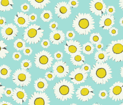 |
| D- daisy field picnic by Elise Bourne |
Kirsten is one of the few that work the theme as a geometric design and not a conversational one. She wanted to create a gingham 2.0 and I really think she nailed it! Her process was wonderful… she created so many variants and then evolved her favourite until she got this clean but yet interesting design. I'm sure this design has everything to become the new picnic must-have pattern.
 |
| E- gingham v2 by Kirsten Blakerman |
Another water-colour genius! Also Helena amazed me with her illustration skills and even more with how she turned them into beautiful vector motifs. I love how all the motifs seem to fall in the right and exact place and how she scattered those tiny ants that look so real! I also like the background subtle texture she created.
 |
| F- picnic fruit by Helena Harvey |
The first thing I thought when I saw this design was: so unique! and yes, it is. It is a very clever take on the theme and that just fascinated me.
 |
| G- picnic blueprint for bug access by Robin Pickens |
Celia's design first caught my attention for its bright pop colours (totally my kind of colour palette) and the 50s diner look. I think in spite of its retro feeling, it is modern take on the theme filled with energy and personality.
 |
| H- googie picnic by Celia Forrester |
When I see this design elegant and romantic come to mind… well, you know what? That's exactly what Lucia's picnic concept was so she created the perfect design to communicate it and that's just fab! I really like her colour palette and how perfectly she used it.
| I- classy picnic by Lucia Barabas |
Karla's motifs are adorably happy! How cute are the dancing fruit and the singing birds? The whole scene is just perfect and so is her use of colour and textures.
 |
| J- picnic dancers by Karla Nunes |
Kiri is another great illustrator. Her motifs looks so real to me. She also chose a beautiful colour palette and created a beautiful ogee pattern that looks really chic.
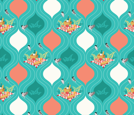 |
| K- chickadee picnic by Kiri Moth |
Quirky motifs, fun bright colours and a great tossed layout made me love this pattern. Louise was one of the few to create a large repeat tile, which allowed her to create a pattern where spotting the tile is difficult. All motifs are beautifully spaced and even though there's a lot going on, there's enough room for the eyes to 'breath'.
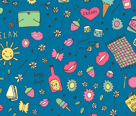 |
| L- lazy days by Louise Parr |
Paula created so many patterns with in her pattern that a huge collection could come out of this amazing design. I really love how she played with the outlined motifs and some filled spaces. The thermos are so old-school they should all be in a retro museum of some sort. Also her food motifs are pretty cool and so is her colour palette (very That 70s Show - it reminds me of Eric's basement, lol). oh! and the background texture just makes it all perfect!
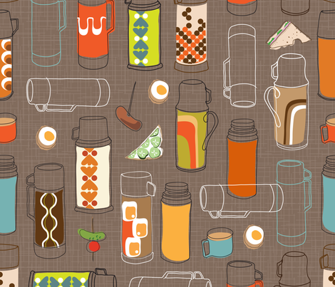 |
| M- retro flasks by Paula Woods |
Margaret's bears are sooooooo cute. They remind me of Winni the Pooh's classic illustrations. The overall design is really beautiful and I really like the way she arranged the motifs to create repeating crests.
 |
| N- picnic for bear by Margaret Kelly |
Please vote for your favourite design below (only one vote per person allowed) and don't forget to leave a comment below if you want to say something to the designers. I'm sure they'll be thrilled to know what you all think. The winners will be announced next Monday here. The first place will receive a Spoonflower Welcome Pack, and the second and third places will each get a USD$25 Spoonflower gift certificate.

